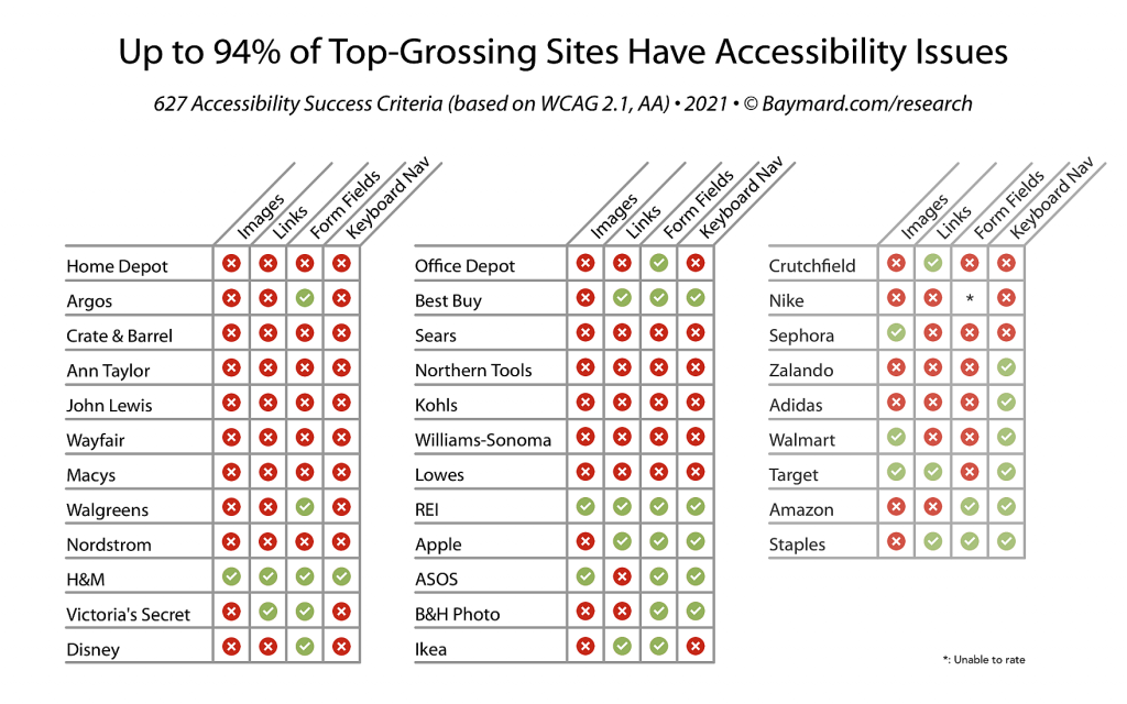
Recent studies performed by the Baymard institute show that 94% of the largest e-commerce sites in the world are not accessibility compliant! We can only imagine that as such, the number is even higher for smaller sites without a large budget for accessibility compliance.
Today we are going to look at the importance of accessibility compliance, the areas mostly concerned with accessibility, why accessibility compliance is important, and the steps you can take to make your website more accessible.
What Is Online Accessibility Compliance?
Websites are accessed by people with varying requirements every day much like physical buildings, but without the equivalent of accessibility ramps and hand rails for your website, you may be leaving many visitors unable to interact properly with your site.
W3C is one of the leading authorities in online standards world-wide, and they have published guidelines for web content to fully conform with accessibility needs. Their guidelines are full and comprehensive, but the reality is that most sites fail to meet accessibility requirements in only a hand full of ways.
The likelihood is that your website already meets most of the basic requirements for accessibility. They are built in to the foundation of most website builders like WordPress, Squarespace and Wix to name a few, but the common areas where sites fail to meet accessibility guidelines are images, links, form fields and keyboard navigation. There are some simple steps you can take today to improve these areas of accessibility on your website that we will dive in to shortly.
The Importance of Having Accessible Websites

Making your website accessible is not just a good idea. In Australia, and many other countries it can actually be a legal requirement! For Australian websites, this falls under the 1992 Disability Discrimination act and requires government websites to make their information accessible to all individuals. Currently there are no laws for non-government, Australian-owned websites to meet these requirements, but that certainly doesn’t mean you should ignore accessibility!
Users with disabilities can have vastly different experiences on websites depending on the nature of their disabilities. Users with visual impairments may have to zoom in on website content, or use tools such as screen readers to audibly relay the information on a screen back to the user. Similarly, users with limited mobility or other physical impairments may not be able to easily use a mouse or keyboard to interact with a site.
In 2014, Vision 2020 Australia, The Australian Blindness Forum, and the National Disability Services reported that there over 575,000 visually impaired or blind people in Australia, with over 70% over the age of 65. If a website fails to accommodate to these users’ needs, then they are essentially not able to use the website at all and can not transact on the website, or can navigate through the site with difficulty to the point of conversion.
Don’t you think it’s only fair to offer everyone the opportunity to transact easily on your website?
Accessible Images
Our studies show that over 82% of websites tested have image compliance issues, but what does this really mean? Images are powerful and impactful, and should be utilised in abundance on websites, but people using screen readers won’t know the context of images unless the images contain Alt text to explain the purpose of the image. This is even more relevant for images that contain text overlay that portray part of the sales message for the page. People using screen readers won’t know what the text overlay on an image says unless Alt text is used to explain the content of the image.
So what is Alt text? Alt text is a HTML markup, or an accessibility-specific label used on images for you to write a description of the image, or to write the text that is displayed in an image overlay. It does not show on screen and is only used by Accessible Rich Internet Applications (ARIA) devices or plugins, such as screen readers.

In this screenshot from Ebay, we can see an image displaying a sale at Dell, but as we have discovered, unless this image has Alt text, visitors using a screen reader won’t know anything more than an image exists at this point on the page. So has Ebay used Alt text to aid users with screen readers?

We can see when inspecting the page source code that Ebay have added alt text to this image that reads “Use code DELL20 – Take 20%* off Dell storewide”. So, any user that is using a screen reader will understand the context of the image now, and the offer being displayed. This is a perfect example of good Alt text implementation.
It is important to make sure all images on a website have some kind of descriptive label either in Alt text, or in a label provided on page with the image.
Accessible Links
It is crucial for links to be easily identifiable when navigating through a website, and even more so for users with disabilities. 73% of sites tested were deemed to have link accessibility issues. Just as with images, links can contain markup to aid users with screen readers to identify the purpose of the link, and where they can expect to end up if navigating through the link. The easiest way to achieve this is to give the link a coherent and descriptive title that aids the reader in understanding the purpose of the link.
It is also important to let links visually stand out on the page. Most users will identify a link as underlined blue text. You can also change the hover state of links so that they change colour for example when your mouse hovers over them. This way users can quickly identify links on a page, understand their purpose, and click through knowing what to expect when they land at the next page.
Form Design and Input Fields
Forms are a crucial element to a website’s ability to create conversions. Whether a simple contact form, a shipping address, or payment information – forms are at the heart of online conversions, so making them accessible and easy to understand are highly important. We found over 58% of the sites tested were deemed to have form usability issues, so still over half of all sites!
When creating a form, there are two considerations to make in the interest of usability. Labels for the individual fields such as name and address, and labels for form groups, such as Billing Information, or Personal Details.
It is not always necessary to display labels for every form field, especially if you are using placeholders to identify the purpose of a form field, but the labels should still be included in the form meta tags so that screen readers can identify the purpose of a form or form field.
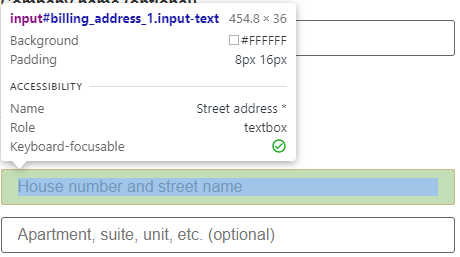
Here we can see an example of a form field for entering the street name. Under the Accessibility heading, you can see the name clearly states the purpose of the form field. Although the form fields in this specific example do not have labels being displayed, they do have placeholders well defining the purpose of the field, as well as an associated name that a screen reader will be able to pick up and relay to the user.
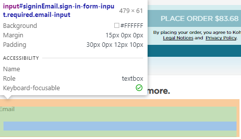
This example however shows an email field on a different website where a screen reader would not be able to identify the purpose of the form field. The user would not realise the purpose of this form field was to enter an email address, so in this case would not be able to sign up as a user of the website, and would not be able to complete the checkout process on the site as the “Name” field is missing.
Keyboard Navigation
Keyboard navigation can be the primary form of website navigation for some people with disabilities. Users can navigate through a website using the Tab key to progress through sections of a website, and Shift + Tab to move backwards. Of the sites tested, 64% were found to have keyboard navigation issues.
There are many factors to consider when looking for keyboard navigation compliance, such as the content to progress in a linear fashion when navigating with the Tab keys, and not jumping past sections when navigating this way.
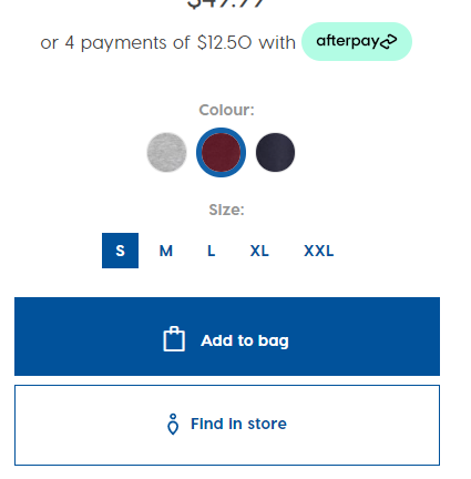
Clothing brand Ann Taylor previously failed to allow the sizing options to be selected when browsing their website via keyboard, meaning customers could not buy clothes from their site by using keyboard navigation if a selection had to be made on the item. This has since been rectified however. At City Beach, even though the colour option is before the sizing, when navigating the page via keyboard commands, the sizing is highlighted before the colour choice. Not overly detrimental to the performance, but could definitely create confusion while navigating.
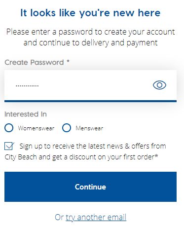
Keyboard navigation can also lead to trapped focus elements where a user is unable to progress further. An example of this is again on the City Beach website, where users navigating the checkout page get stuck at the password creation stage when navigating via keyboard. Once you enter your password, the tab key will not take you beyond the password field, so users are unable to continue through the checkout. This is a very common, yet very frustrating example of a site leaving disabled customers unable to complete a checkout at one of the very last steps of the checkout experience.
Summery
Online accessibility is an often forgotten and under-appreciated consideration in the development of websites, but leaves many users unable to access the content or services they are looking for. Almost all websites face accessibility issues, both big and small, yet with careful consideration and appreciation for people that require the use of screen readers and navigation aids, web developers have all the tools at hand they need to deliver fully functioning and accessible websites.
Action Analysis can assist your business in becoming Accessibility compliant. To find out more, contact Action Analysis today!